
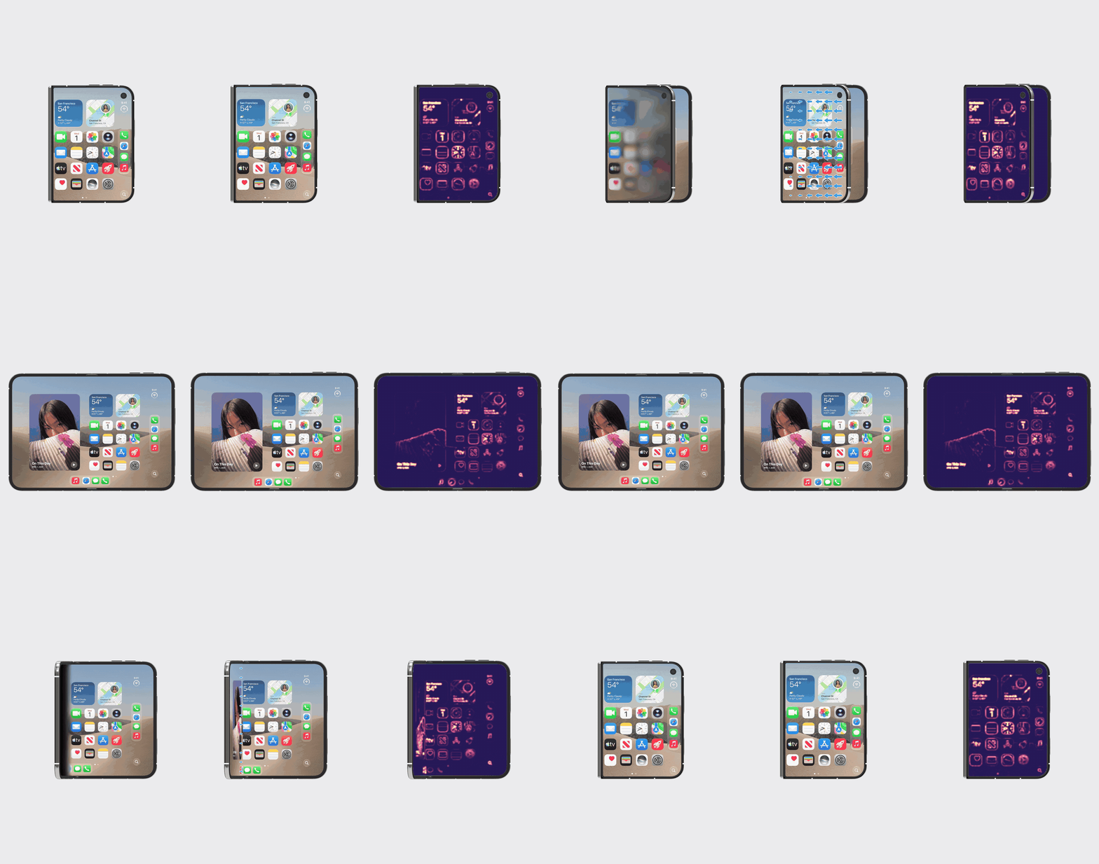
What stood out for me about the iPhone Duo is its closing and opening animation. It is mesmerizing and looks remarkably polished. It just feels good visually.
If we look closer at the video, two things are happening at once:
- the screen blurs and darkens
- the content inside the screen seems to “stick” in space.
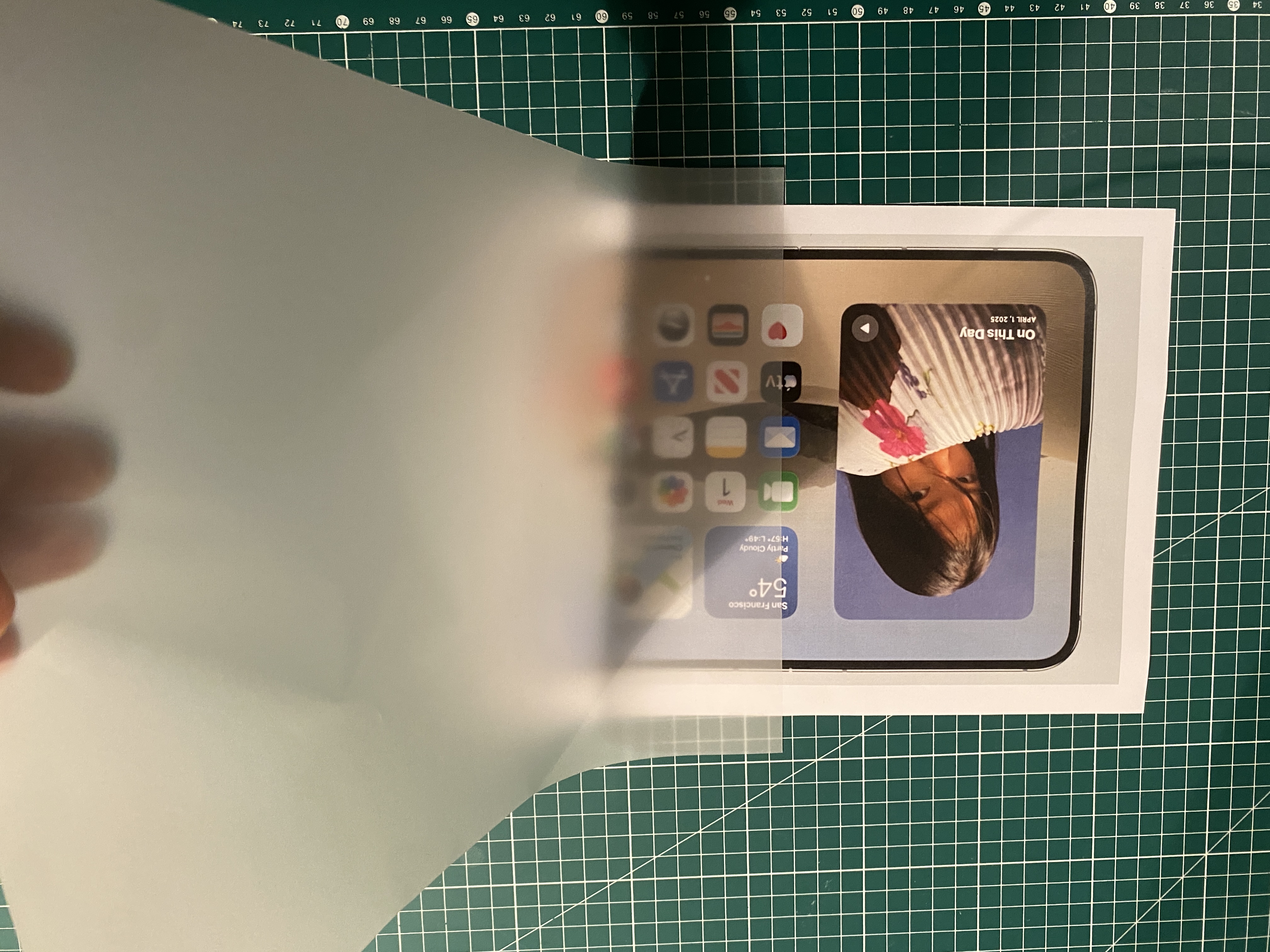
Both effects reminded me of tracing paper1. So I printed a picture of a phone screen and bought some tracing paper to check.
When pressed flat against a picture, the paper behaves as an almost transparent sheet. But when lifted, we can notice how the picture underneath softens, as if a blur effect were applied to it. The actual phenomenon behind this is light scattering caused by the cellulose fibers in the paper scrambling the trajectories of photons. The further the paper is from the picture, the more that scrambled light spreads, and the blurrier the picture gets. Another thing we notice is how, if we lift the paper without lifting the background, we get this distinctive blurry window effect: the picture remains in place as the paper moves over it, similarly to the content “sticking” in 3D on the iPhone Duo!
So I set out to test this intuition in a simulated environment where I’d have finer control over light and material properties.
Drag the paper to lift it off the painting. Use Ray spread to change how strongly the paper scatters light, and Move view to look at it from another angle.
Open in Labs (opens in a new tab)Source on GitHub (opens in a new tab)
I then brought the tracing paper into the form factor of the phone by thinking of the iPhone Duo’s screens as translucent sheets of paper, and the wallpaper and apps as the picture underneath.
I made this Opening Transition simulator to investigate how the effect is assembled. Scroll to drive the folding, or grab the moving screen and drag it around its hinge.
Open in Labs (opens in a new tab)Source on GitHub (opens in a new tab)
Now our question is: why does it work? As in, why does it feel good?
My hypothesis is that the effect is more than decorative, and the design team considered visual comfort and stability. In fact, the folding and unfolding motion is quite unique, and iPhone owners aren’t used to their screen showing up at sharp angles. They also aren’t used to screen content moving around repeatedly. So you need mechanisms to palliate the disruption that this interaction mode might cause. You’ve introduced something that might feel unnatural, so now you must go the extra step to bring more naturalness into the whole. You need softness, pleasantness.
So I tried to turn visual discomfort, which is a perceptual experience, into something quantifiable. I settled on two metrics: detail energy and optical flow.
- Detail energy measures how much fine, high-contrast detail appears on screen.
- Optical flow measures how much the content moves on screen from one timestep to the next.
Both metrics are computed in screen space, which is the most viewer-centric approach we can use, and thus the most first-person-like, perceptual assessment we can make within a simulation.
What we notice here is that each mechanism tackles one of the two problems. Blur dampens the detail energy jumps, while stenciling cancels the optical flow contribution from the folding operation. The key is that we aren’t changing the optical flow or the visual energy of the entire environment experienced by the user. In fact, the user can still rotate the phone and move it in space, which would drive up both the flow and energy metrics. What we’re interested in is reducing the extra flow and energy that folding adds, compared to regular, non-folding phone interactions.
You can try it yourself below by switching between the two metrics, and folding the phone manually. You can also modify the image displayed on the phone to see how various visual patterns impact those metrics.
As a result, what first looked like a polished visual flourish turns out to be the result of two subtle design decisions: blur preserves visual comfort during screen rotation, and the stencil keeps the content anchored in space while the hardware moves around it. When brought together, the device feels like a window onto spatially persistent content.
But if we take a step back, what does the iPhone Duo signal? By anchoring content in a “virtual” space inside the screens, and by allowing the content to behave as though seen through a physical window, the device feels consistent with the real world, which makes it less disruptive.
This is part of a broader shift towards more seamless computing. Agentic AI is making it possible to execute very complex tasks via an interface that is seamless to us, called natural language. Wearable devices provide extensive context about our state and our experience of the world. This increases our surface area with computing.2
Each step of the path towards complete seamlessness is equally important. In fact, each step conditions the next.
So when we look at the design decisions made on devices such as the iPhone Duo, we need to look at them as value statements3.
What matters to us? How do we want the inexorable forward thrust of computing to affect our lives?
Many thanks for the insightful conversations and valuable feedback, in particular to Sylvan Shen, Prabath Udakandage and Andrea Bergonzi.
Footnotes
-
The tracing-paper comparison was noticed by mumu木川 (@linmumu223) on X: “Amazing! The design inspiration for the iPhone Duo?” (translated from Chinese). ↩
-
Think of it as wrapping a cloth around an object, the better you know the shape of the object and the more flexible and fine threaded your cloth, the better you can conform to its shape. In our case, the shape is the feature domain of machine-free reality across all senses. That is, the way the world feels like as subjective beings, when our experience is not intermediated by what we currently refer to as computers. Until now, the experiential shape of computing had been severely constrained by the discrete and deterministic nature of machines. But as we delegate our interaction to thinking machines we allow ourselves to build more continuous and fuzzy shapes, which fit our physical and cognitive constitution a lot better. To curate and mold this slow transformation is the culmination of work across operating systems, interaction design, machine learning, hardware and, increasingly, robotics. ↩
-
Technology is Not Values Neutral: Ending the Reign of Nihilistic Design, The Consilience Project. ↩